
Sure, we all love those gorgeous, sprawling kitchens you see on Pinterest, but here’s the thing — small kitchens don’t have to feel like a letdown. They just need a little creativity and smart planning. Yes, it’s pretty straightforward to design something stunning when you’ve got tons of space and an island that seats eight, but small kitchens can be equally stunning. You’ve just got to be intentional about it so you can create something that looks amazing while making the most of what you’ve got. That’s why you’ll find tons of design tips online about what to steer clear of in tiny spaces — they can make the room feel even smaller. But here’s the catch: most of those tips miss the bigger picture. Honestly, you can work just about any design trend into a small kitchen if you do it right. Take dark countertops, for example. You’ve probably heard that they’re a no-go in tiny kitchens because the dark color can squeeze the space even more. But Kerrie Kelly, CEO & Creative Director of , begs to differ. She tells House Digest exclusively: “Dark countertops can totally work in a small kitchen — you just need to use them smartly.” She goes on to say: “What really matters isn’t whether your countertop is dark or light — it’s about whether everything works together. Sometimes, a rich charcoal, deep graphite, or moody stone can bring sophistication and depth that actually makes a small kitchen look more polished and spacious.” The key? Just don’t go dark everywhere else too, or you’ll end up with a gloomy little cave instead of a kitchen. Keep reading to learn how our expert suggests dodging this design pitfall.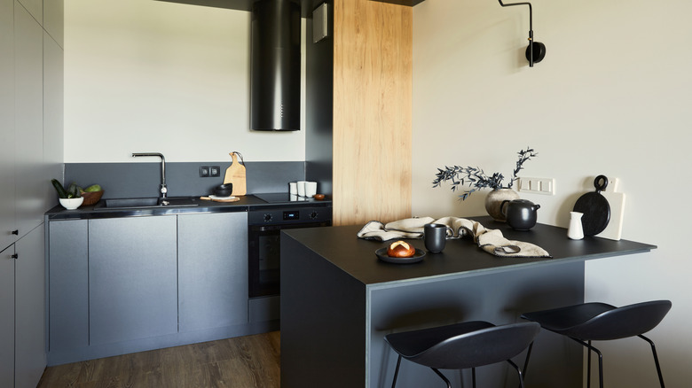 Followtheflow/Getty Images
A Hidden Countertop Option Worth Trying in Your Small Kitchen
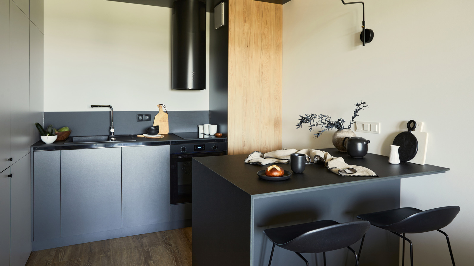
Why dark countertops work in a small kitchen
 Katarzynabialasiewicz/Getty Images
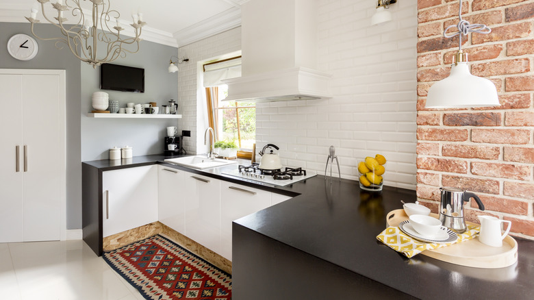
 Usually, when people are working with a small space, they load up on bright whites to try and make it feel more open and airy. But Kelly wants to challenge that thinking. She tells House Digest: “My best advice? Stop worrying so much about making your kitchen feel bigger and start focusing on making it feel put-together. A small kitchen that’s well-designed can actually feel way more luxe than a big kitchen that’s poorly planned.” And that’s exactly why dark countertops can work beautifully. “Dark surfaces anchor a space really nicely. When you pair them with lighter cabinetry, shiny finishes, multiple layers of lighting, and thoughtful material choices, they create contrast and visual interest that makes a small kitchen feel intentional instead of cramped,” she notes. And those lighter cabinets don’t have to be plain old white or cream, by the way. Martha Stewart’s Bedford kitchen, for instance, pairs light butter-yellow cabinets with black countertops. Or, if you’re into the whole natural-wood-cabinet trend that’s blowing up right now, go for light wood like white oak with your dark countertops.
The problem is that most people pick out their dark countertops without thinking through the rest of the kitchen’s design. “Things go wrong when dark countertops get mixed with dark cabinetry, not enough natural light, and not enough contrast,” Kelly explains. “It ends up feeling heavy and overwhelming. You’ve got to think of the countertop as just one piece of the whole picture, not as something you’re choosing on its own.” So before you fall in love with that black soapstone or moody marble, make a plan around it. Here’s how to do it right.
How to make dark countertops work in a small kitchen
 Dmp/Getty Images
 To keep those dark countertops from feeling too heavy, you’ll want to surround them with lighter shades that help balance things out. Picking the right colors can be trickier than you’d think, though. Luckily, Kelly has narrowed it down to three go-to categories. She tells House Digest exclusively that she loves “soft warm whites and creamy neutrals that bounce light around and make the space feel open,” mixed with “warm taupes and sandy tones that add some depth while keeping things calm and timeless,” plus “light, stone-inspired grays that bring subtle texture and movement without feeling too heavy.” Think Benjamin Moore’s and, or Sherwin-Williams’s or
As you’ve probably noticed, these aren’t your typical stark whites or boring neutrals. They’re more “cozy beige linen” and less “printer paper white.” Each of them has its own flavor and personality, and there’s actually a really good reason for that. They just feel more welcoming. “Skip the super bright stuff and look for colors that feel soft and natural,” she says. “The best small kitchens have layers and personality — not that sterile vibe.“
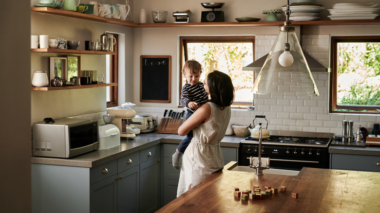
But it’s not just the colors you pick — it’s how you use them. Think about creating contrast in smart ways to keep those dark countertops from visually weighing things down. “Lighter walls, shiny backsplashes, good lighting in layers, warm metal finishes, natural wood touches, and thoughtful decorating all help balance out darker surfaces,” she explains.