Manny Carabel/Getty Images
When it comes to creating a cozy home, you can depend on Erin Napier’s expertise. The interior designer and HGTV star is known for transforming old, historic homes into updated dreams, while still preserving their classic charm. In fact, she and her husband have made their own country house into a charming, private escape with coziness and peace in mind. It’s no surprise, then, that you’d want to take a page from her playbook. One way to recreate her intimate, lived-in look in your own home? Using a green paint shade that’s inviting, classic, and oh-so cozy.
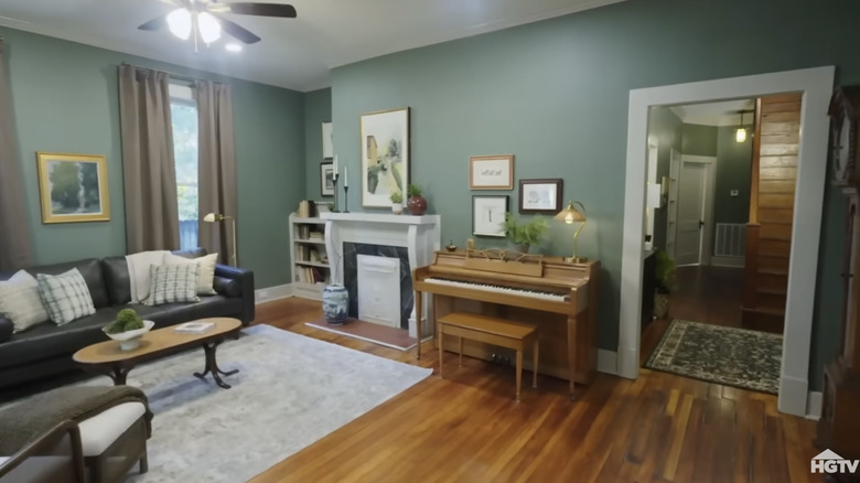
In Season 9, Episode 5 of “Home Town,” Ben and Erin Napier transform their client’s first house into a cozy, classic English home. Their client, Whitney, describes his love for architecture and draws inspiration for his future home’s renovation from his mom’s Craftsman home. The reveal shows a mix of old and new elements, including a marble fireplace and a classic gallery wall. To get that classic, lived-in look for the living room, Erin uses a soft, neutral green paint shade throughout the space, complemented with white trim to achieve the look of a Craftsman-style home.
The use of green paint makes sense, given that the color green itself has a positive psychological effect on us. According to color psychology, shades of green in interior spaces can provide feelings of calm and tranquility, soothing whoever steps into a room in a way that feels genuine and deliberate. That’s because green is related to nature, so using green paint can connect us to the peace that being outside brings. This is one of many reasons why green is such a great choice for creating a cozy, inviting space.
How to achieve a cozy, Craftsman-inspired look in your home with green paint
Choosing your shade of green is the fun part, but it should be done with careful consideration, especially when trying to create a cozy environment. While green shades can naturally promote a sense of calm, the undertone and shade of your paint matters. For example, a dark, moody shade of green, such as Salamander by Benjamin Moore, is sophisticated. This dramatic shade can create a statement of luxury and allow other shades to contrast with the space while still maintaining a welcoming atmosphere.
On the flip side, if you’re looking to brighten up your space, you might do better with a lighter shade of green. Wickham Gray by Benjamin Moore is a sage green shade with a neutral undertone. This color is perfect to use in spaces for a classic, airy atmosphere that also feels lived-in. To create a classic English home style, consider pairing the lighter shade of green with a dark wooden trim.
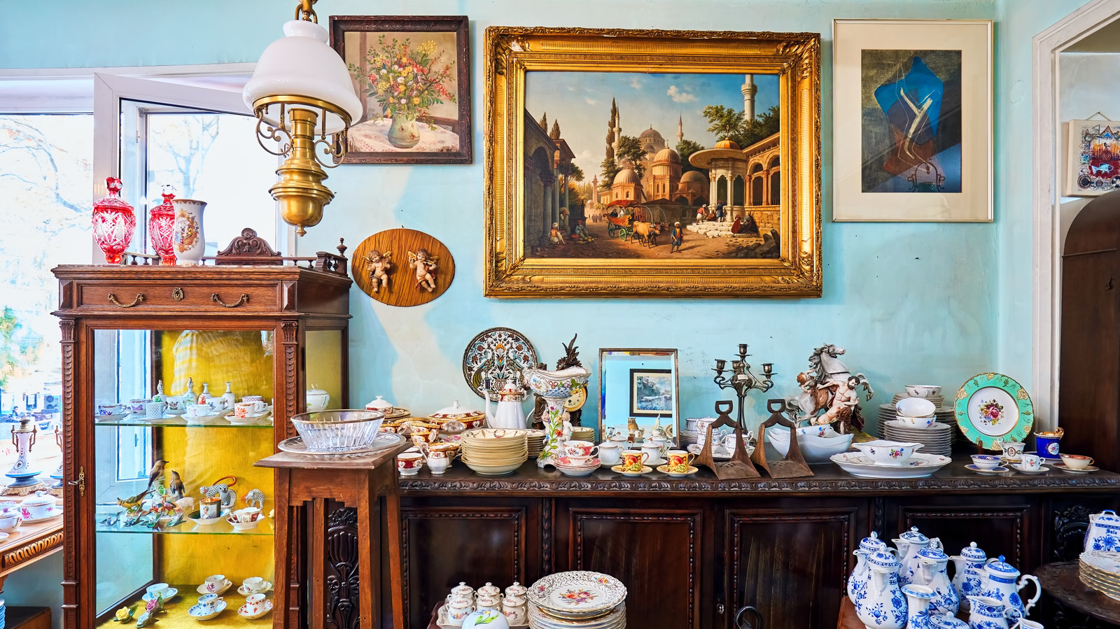
You can further lean into the classic English country aesthetic by mixing in modern and vintage elements. A neutral-toned modern sofa, for instance, can blend beautifully. This is especially true when you add vintage pieces like frames with unpolished brass or gold.